A company with 45 years of history has much more done than said.
In this project, we searched for the origins of the company and discovered its ownership.
Client
Império Materiais de Construção
Category
Logo, visual identity and commercial materials.
DATA
2022
Contexto
Founded in 1977, Império Materials de Construção is a chain of stores that operates in the region of Vales do Mucuri and Jequitinhonha. Initially, the challenge was to modernize the visual identity, and during the process, it was realized that we were dealing with a rescue.
In the research phase, we identified that the current visual identity did not live up to the company's name and that we needed to bring more strength to the project.
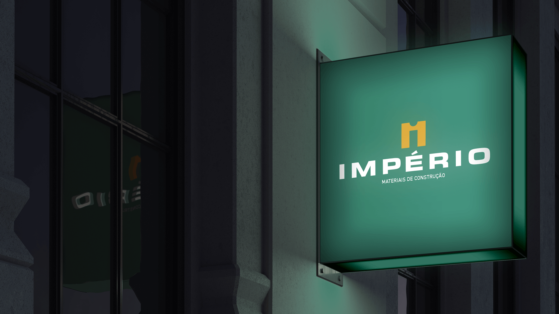
With several points of contact, the brand needed to be flexible and versatile to work efficiently on facades, vehicles, uniforms, labels, stationery, gifts, social networks, etc.
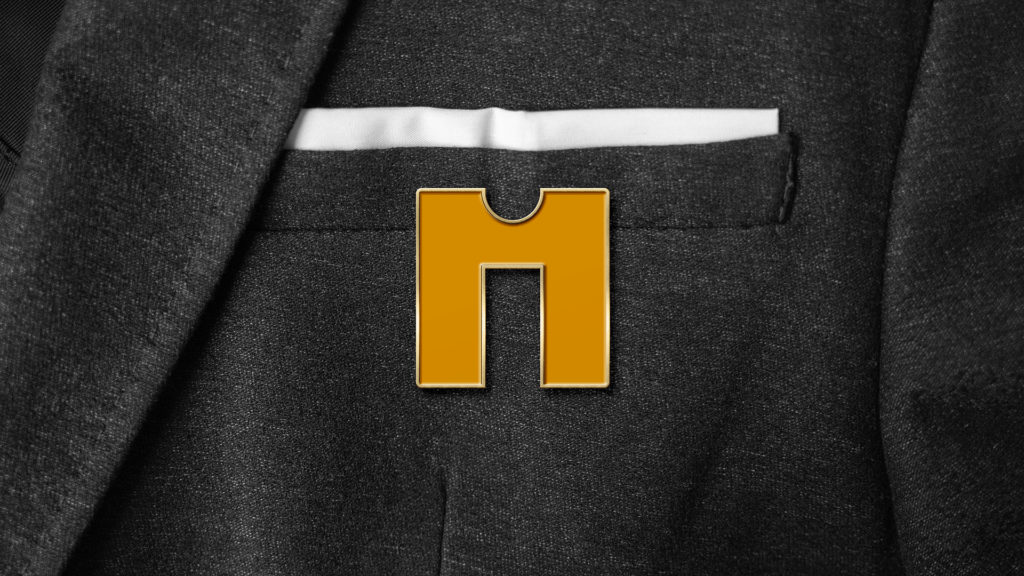
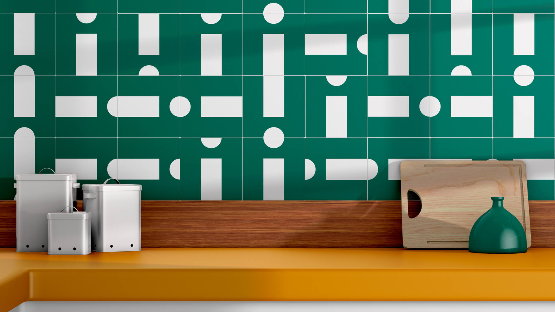
The end result, made the symbol of the Empire, also become a product.
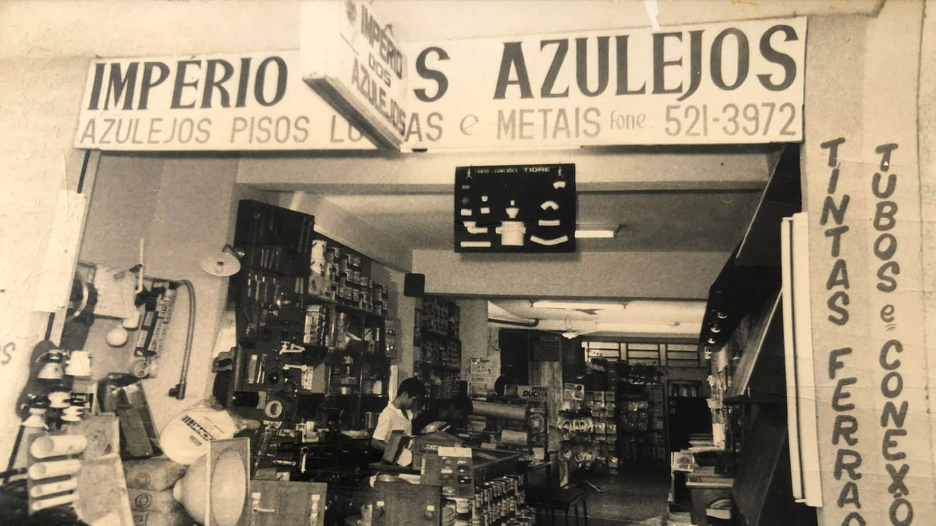
First logo in the first unit of Império dos Azulejos – Highlight for the flag plate with tile in the logo.
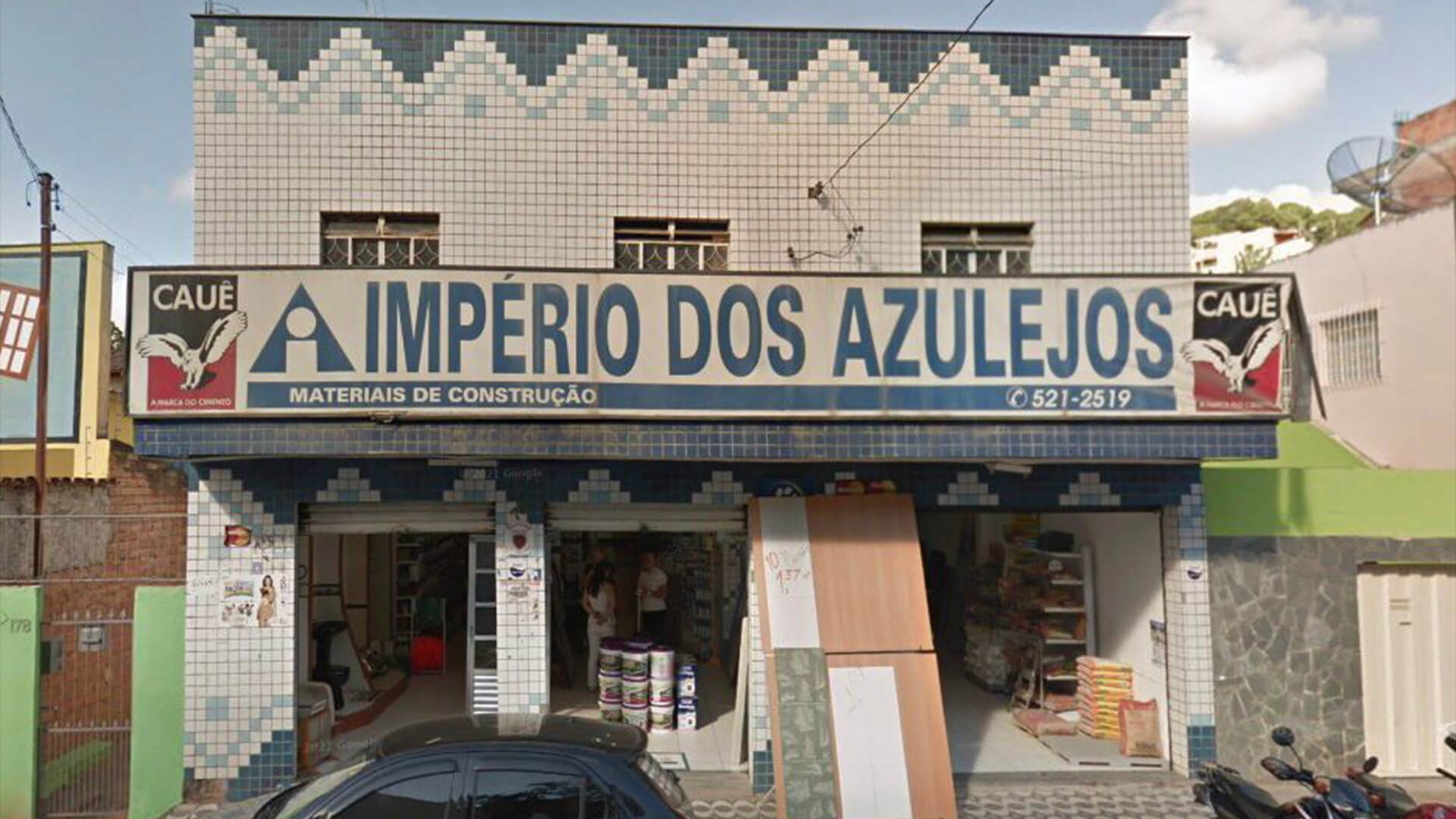
Second right in the second unit of the Empire. In transition phase to Empire Building Materials.
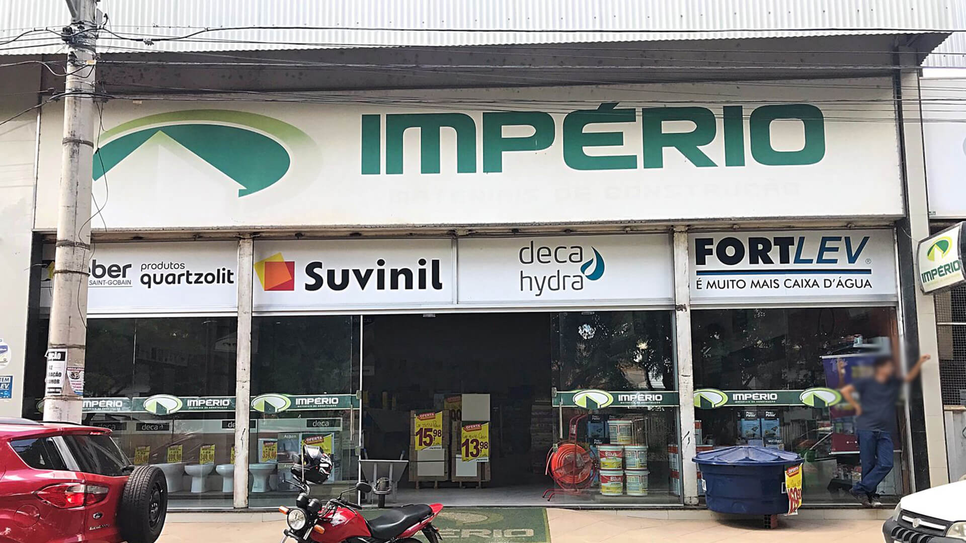
Third logo at headquarters and 5th unit of Império. Photo would be taken just before the visual identity update.
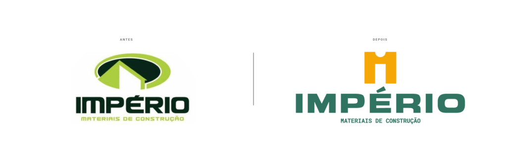
Evolution or revolution?
In redesign, we usually talk about revolution or evolution, but this work is never just about the visual identity, it's about the brand as a whole. And this understanding was fundamental for the evolution of the project.
With more than 15 years, the current logo had a symbol that allowed two interpretations: a house seen from the front and a grocery store in perspective. In none of the readings did the symbol represent the company well or make any association with the name.
"There was a gap between the name and the visual identity.
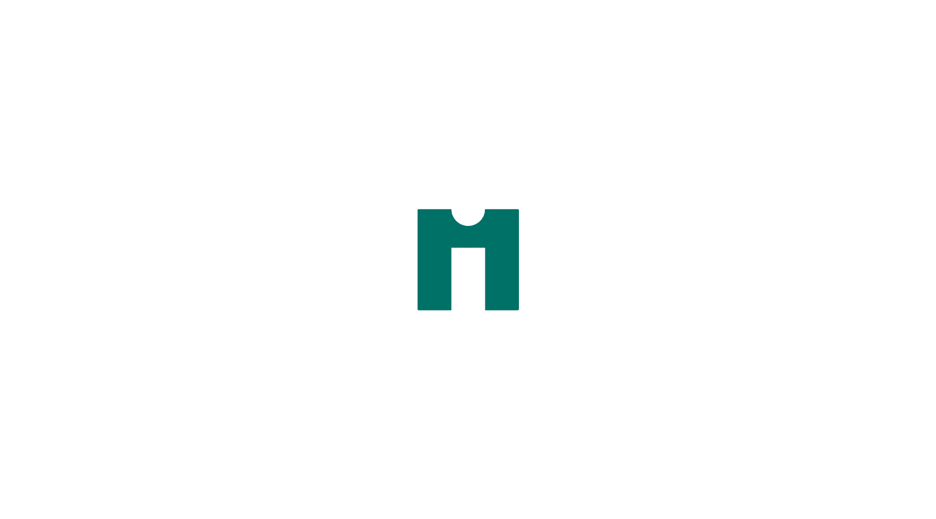
Understanding this problem was critical for the decision to seek a semantic connection in order to increase the sedimentation capacity, association and chance of remembering. The solution brings layers of understanding that can be read all at once, or at different times. Playing with the reader, by “hiding” the letter i in the counter-shape, creating a resemblance to a kingdom icon and transforming the symbol into a tile, the new visual identity of the empire brought ownership to the brand.
Symbol composition.
Definition & Composition
In this project, I used ingredients from the methodology Ana Couto, presented in the course “Applied Branding”. The investigation of the business, integrating brand, business and communication, made the creative process fluid and helped the client in directing and delivering critical information for the project.
In the conversations, we discovered a lot about the business, but I highlight here, the relevant information for the graphic solution:
The first name was Império dos Azulejos.
The first logo had the name painted and the symbol was a real Portuguese tile (on the flag plate).
The founder, Seu Tim, in the search for innovation, would buy white tiles and drive from Teófilo Otoni to Belo Horizonte, so that an artist could paint one by one.
Until today it is recognized as the former Empire of Tiles by several customers.
The idea of the tile being the company's proprietary ingredient was what made this redesign not an evolution nor a revolution, but rather, a ransom.
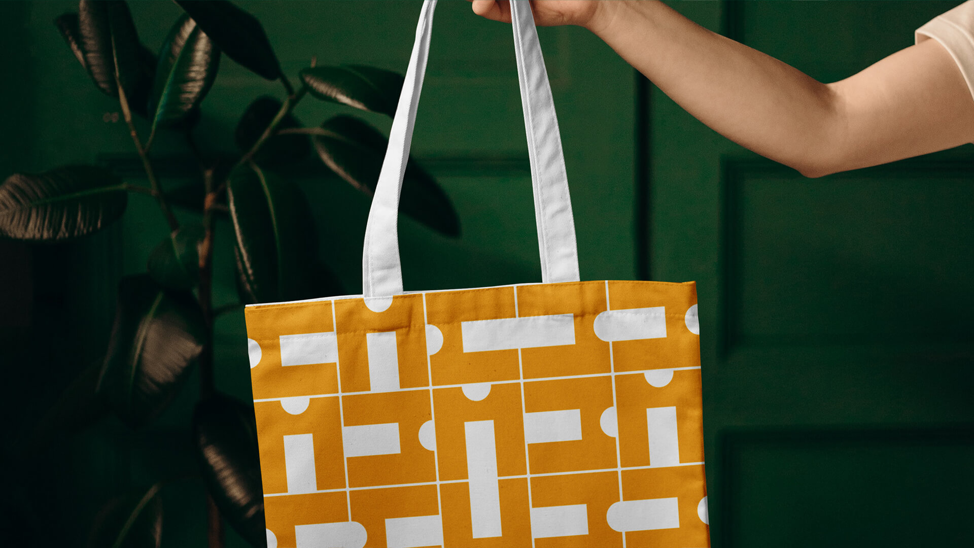
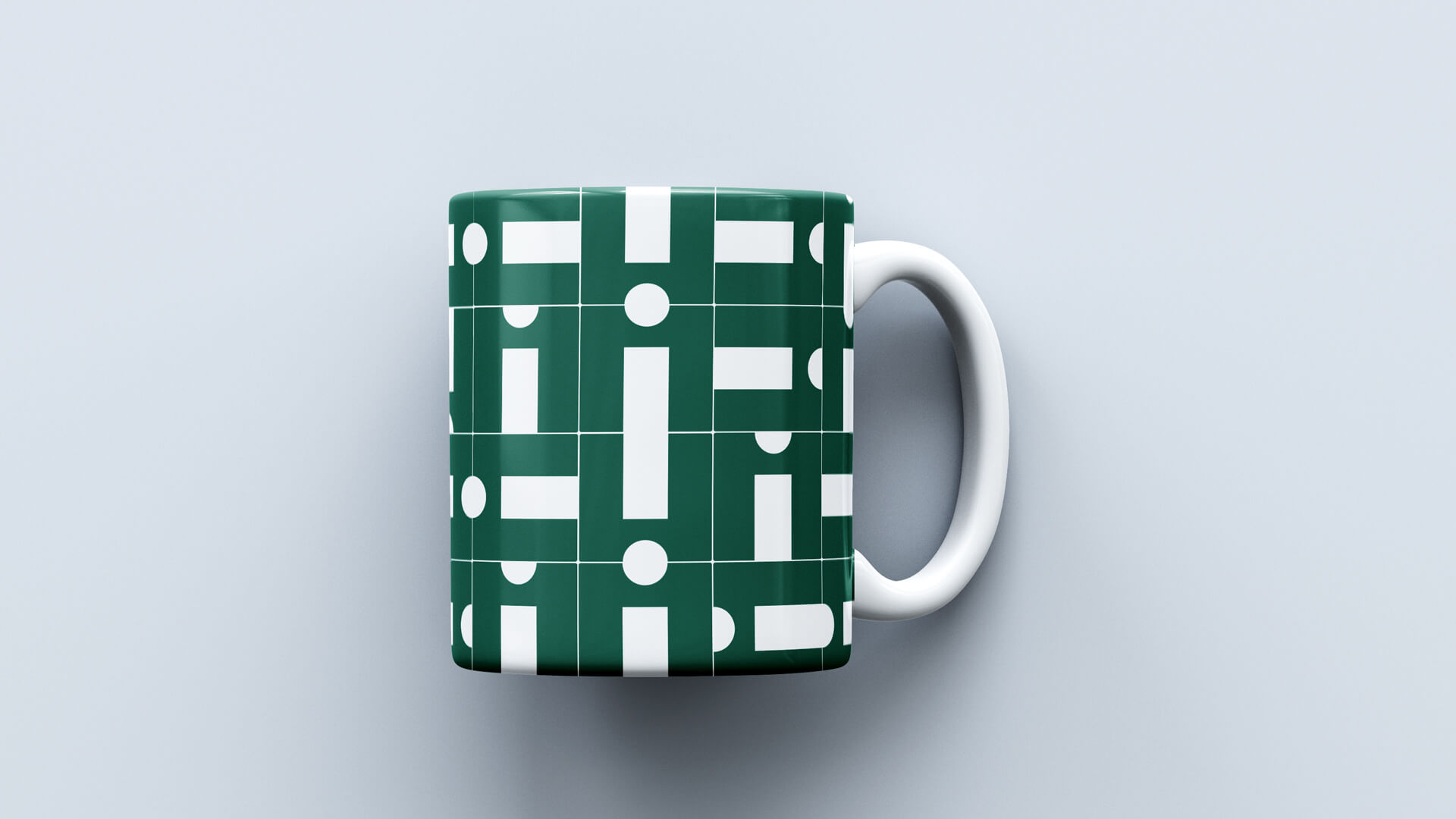
Main pattern.
Pattern Império dos Azulejos
With a quadratic structure, the symbol became, without change of form, the rapport of the brand's visual standard. Creating a visual system that stands out for being:
Flexible: Going from a small souvenir to a big wall.
Alive: working with any color application and preserving its counterform.
Owner: is more than a symbol of the Império, this is the tile from Império..
Logo composition.
Logo Main
The redesign of Império's visual identity brought a reinterpretation of an old symbol of the brand. With the definition of objectives, market research and competition analysis, we discover what to keep (color), what to lose (generalíssimo) and what to add (property) in the brand's look.
Strategically, we updated the shades of green (main color) from the color palette and added yellow gold to the symbol.
Following the transformation, we developed a logo that elegantly balances letter spacing and visual weight.
Logo application.
Applications & Tools
With a clear intersection between graphic design, textile and coatings, the unfolding of materials gained personality in a natural, elegant and proprietary way.