Architecture is not just about filling the void of a space, but also about valuing the void that exists in it.
In this project, we seek to represent the Leonardo Rotsen Architecture office through fundamental concepts.
Client
Leonardo Rotsen
Category
Logo, visual identity and commercial materials.
DATA
2022
Context &
Challenges
In the market since 2004, the architectural firm Leonardo Rotsen is recognized for the development of high standard projects. In addition to serving clients in Brazil and abroad, the firm also participates in events such as Casa Cor and Modernos e Eternos and works together with large construction companies throughout Brazil.
The creation of the corporate visual identity of the office brought as a central challenge the creation of a symbol that represented the office with the modern style of the architect. It is noteworthy that the "modern" here refers to both contemporaneity and the modernist movement, both present in the language of the professional.
Video of the concept and process behind the new office logo.
Differential
The project is distinguished by its visual weight, contrast, application of the gestalt and clear use of basic shapes in the graphic composition of the symbol and pattern, ingredients that meet the personality of the office.
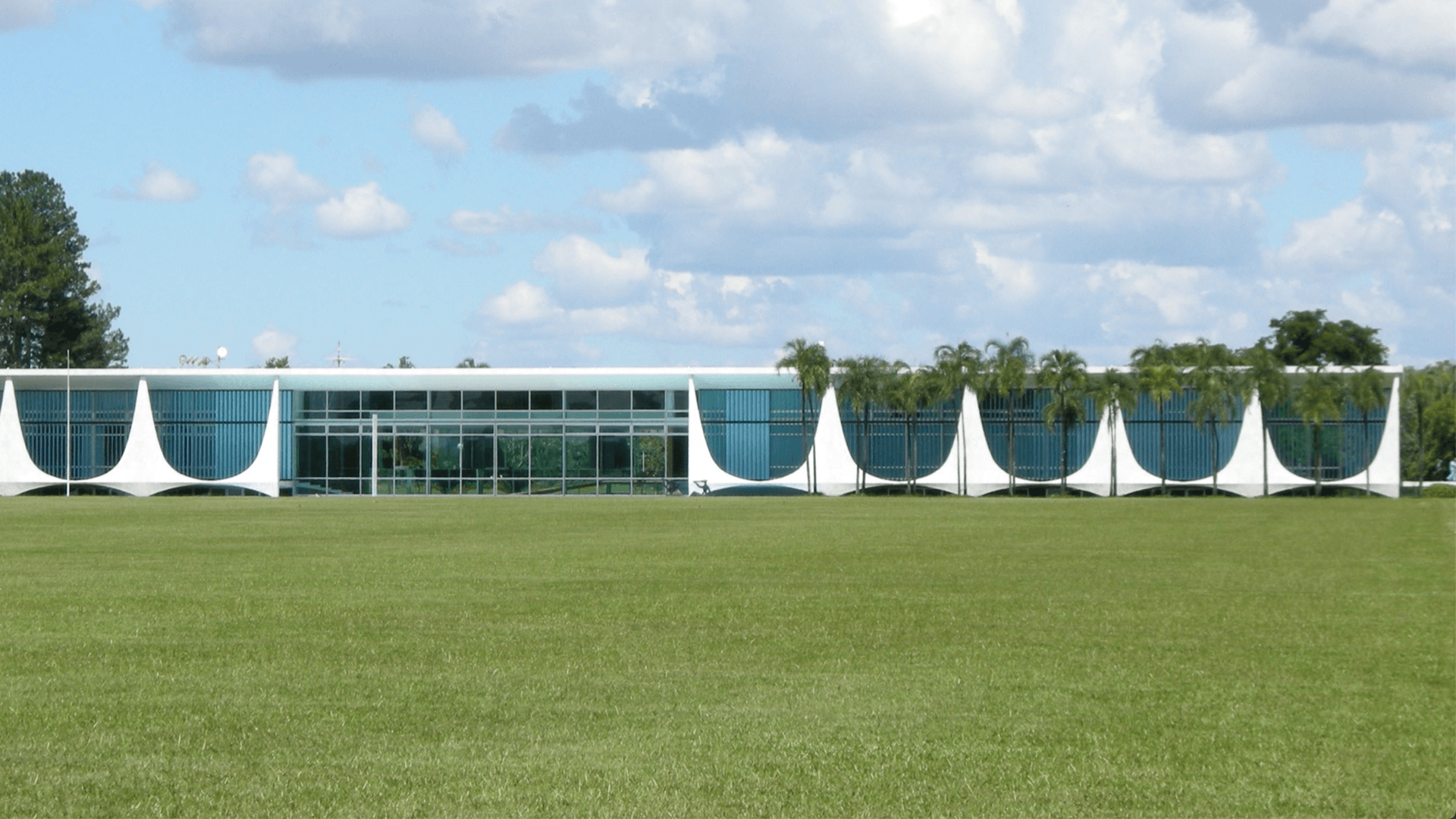
Alvorada Palace – By Oscar Niemeyer. Photo: Leonel Ponce
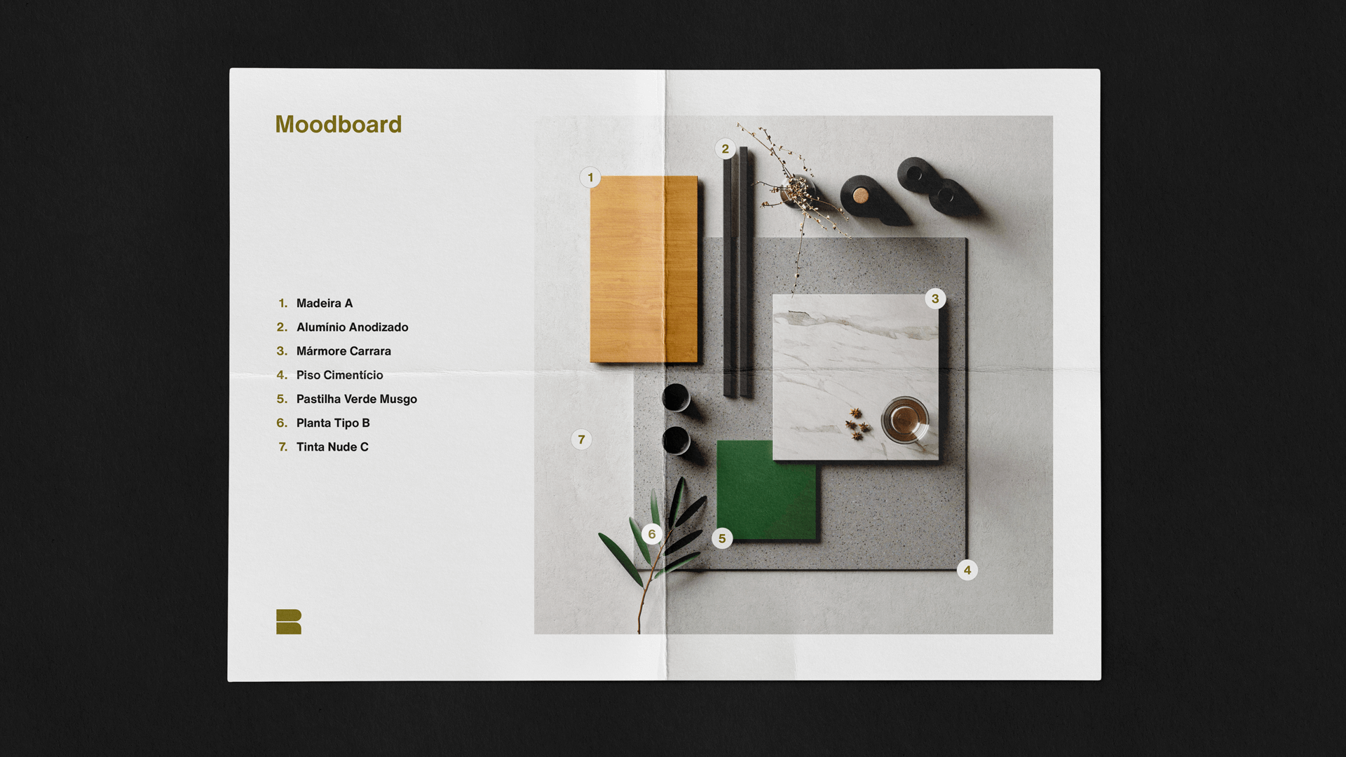
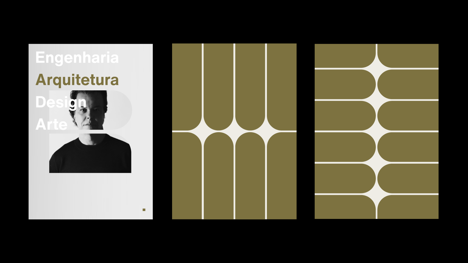
The central concept of the Leonardo Rotsen brand symbol was born from the study of floor plans. In them we observe how the negative field represents the empty space in the architectural project and how it is indispensable for understanding the whole.
From this understanding, the concept of Gestalt closure and other ingredients such as counterform, breather, margin, passage, etc. came to light and assisted us in the development.
Immersion
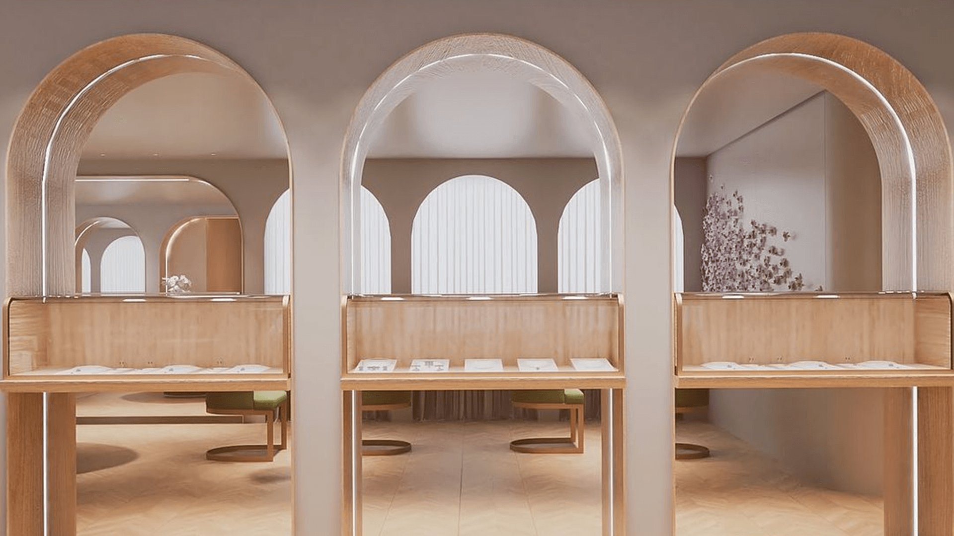
We entered the world of architecture and came across the various works. We highlight Palácio da Alvorada, by Oscar Niemeyer and the office project for Cibele Andrade Jóias, which elegantly uses portals with round arches and furniture with organic lines.
“Doors and windows always represent great weight within the segment and this style of portal, the arched one, is timeless in architecture.”
Symbol composition.
Definition & Composition
With these conceptual pillars, basic shapes (a square and a circle) and a little breath, the symbol that represents the initial R of the architect's last name was born.
From the same origin came the developments of the brand, such as its visual patterns, which subtly show the reference to the Palácio da Alvorada and the arched portals.
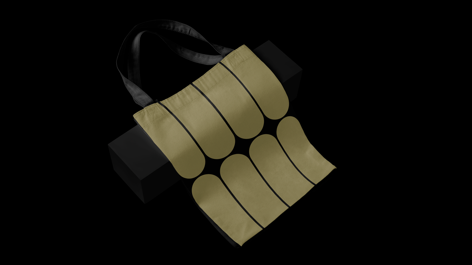
Main pattern.
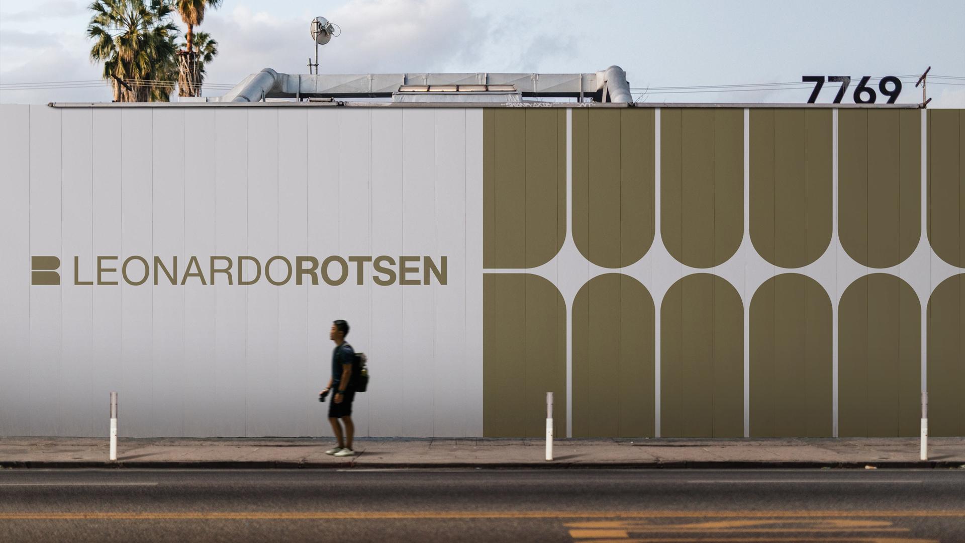
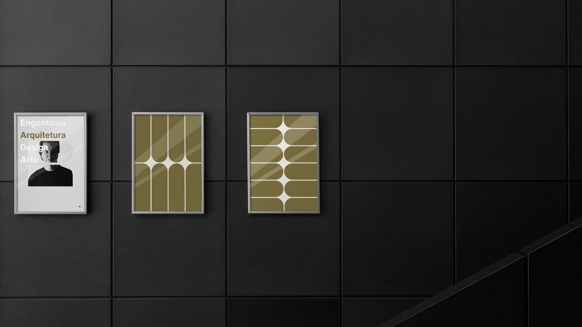
Pattern Alvorada
The brand symbol can generate countless graphic patterns due to its compositional simplicity. The main pattern is a play between the columns of Palácio da Alvorada and the office symbol and was named as a tribute to the architect Oscar Niemeyer.
Logo composition.
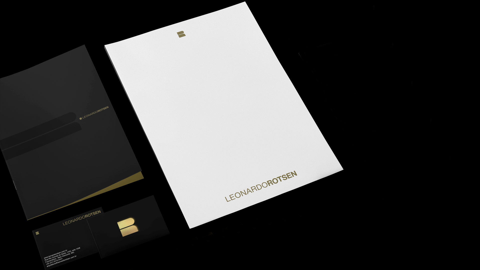
Logo Main
The office already had a logo with no spacing between words. The weight difference between name and surname was what distinguished the logo. But small sizes did not work well.
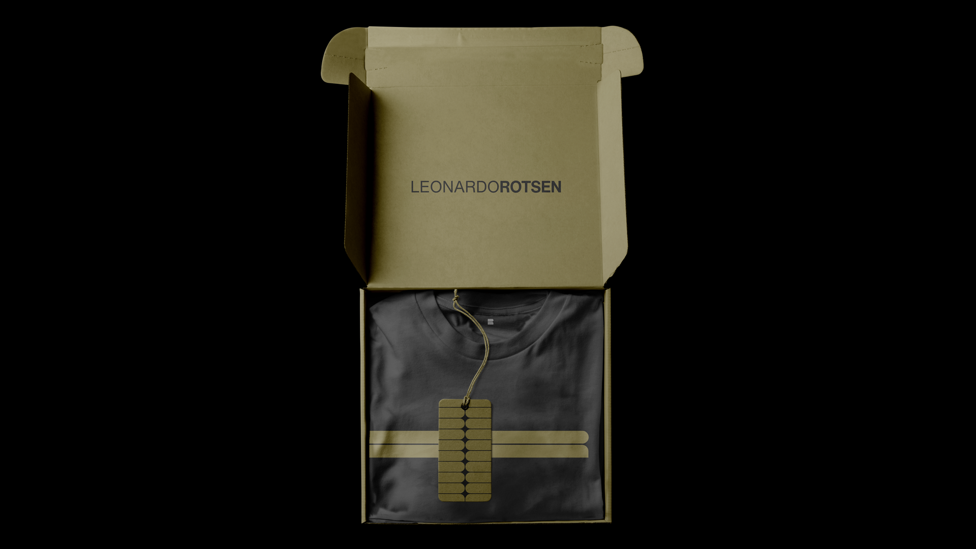
As a color, they used yellow gold, and because it did not have a color code, there was no consistency in the materials.
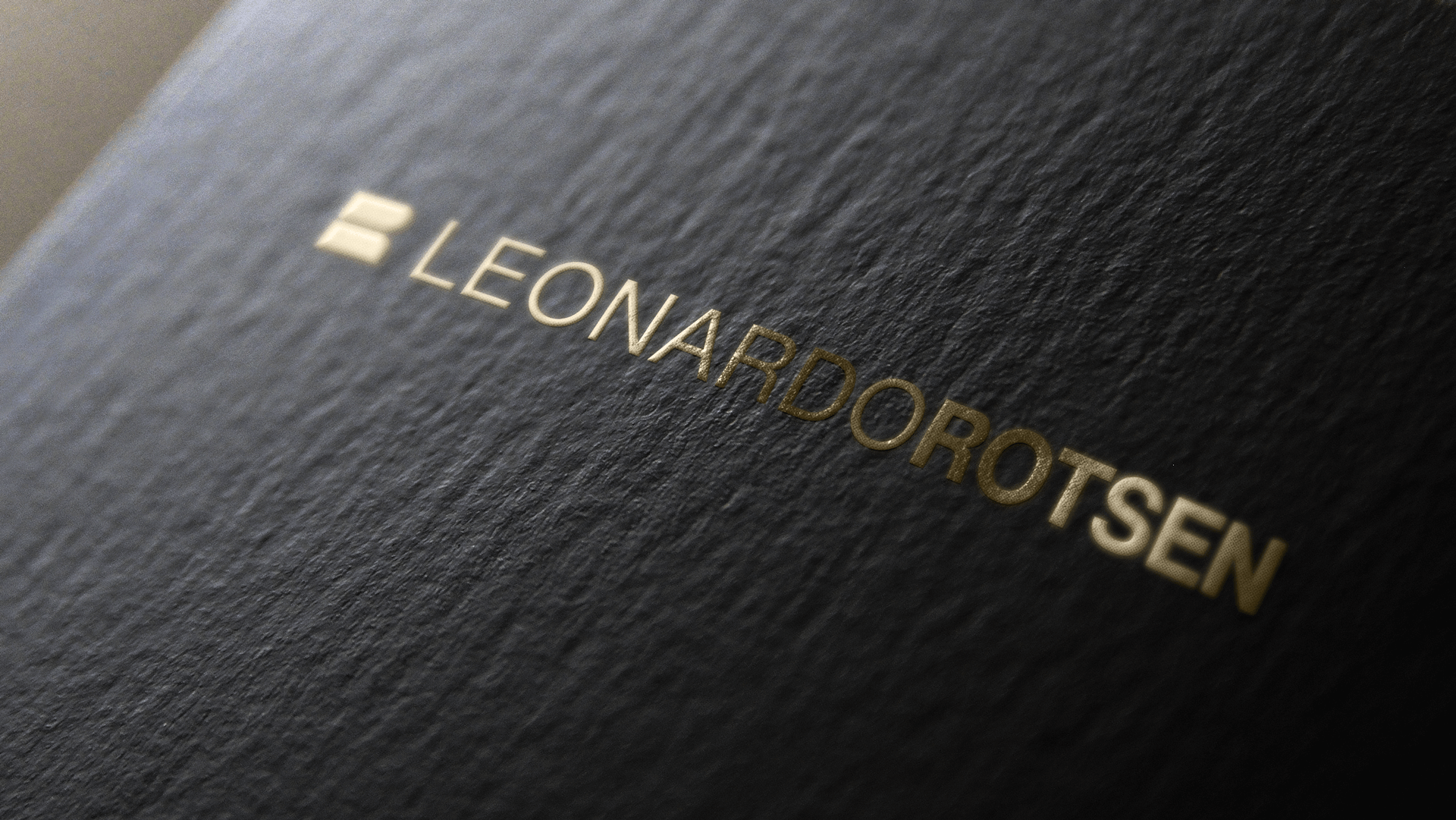
Following the evolution of the brand, we have preserved the characteristics of the logo (in use since 2004), we have updated the typography, color palette, defined finishes, correct use and artistic applications.
Logo composition.
Motion design.
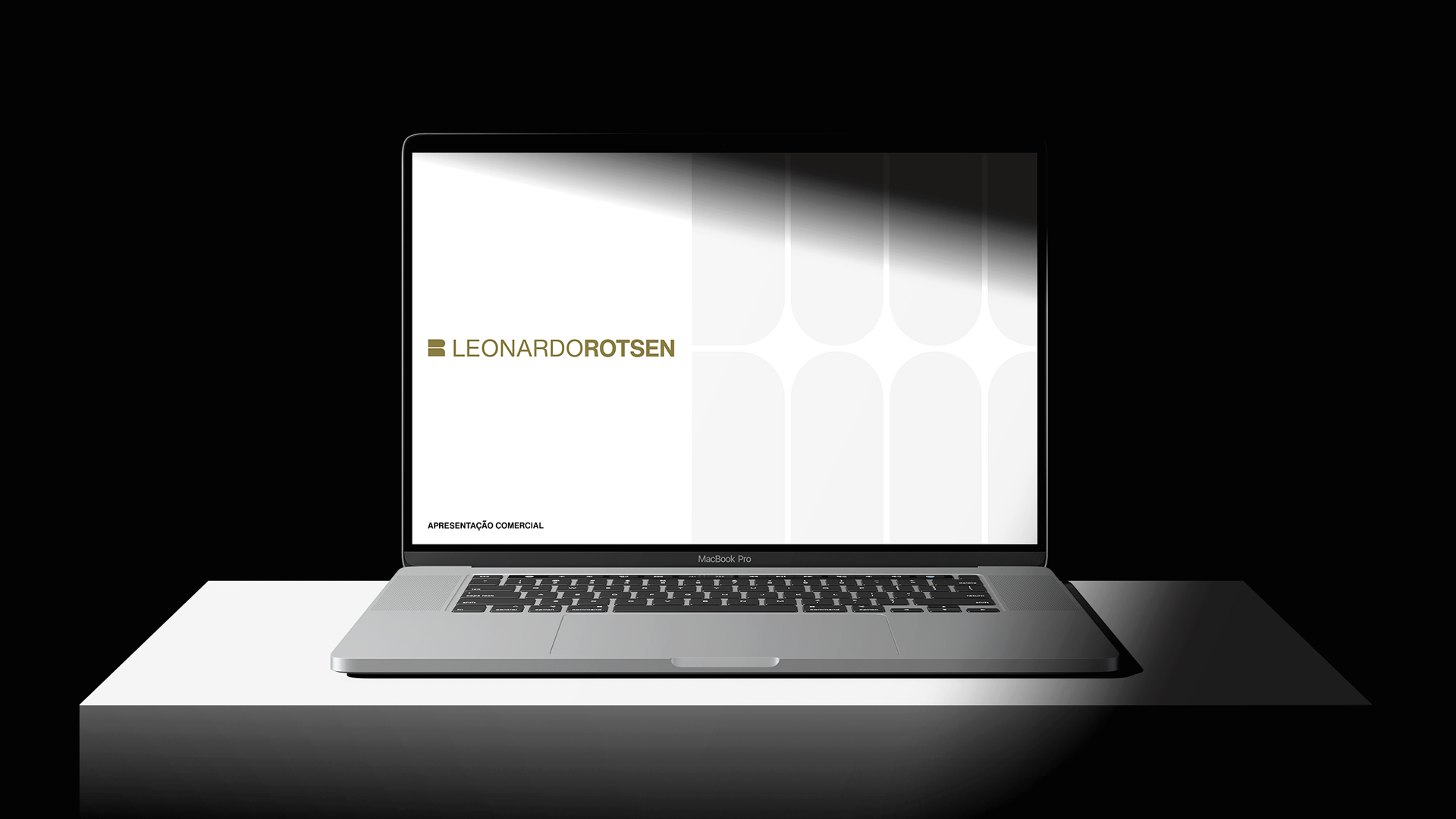
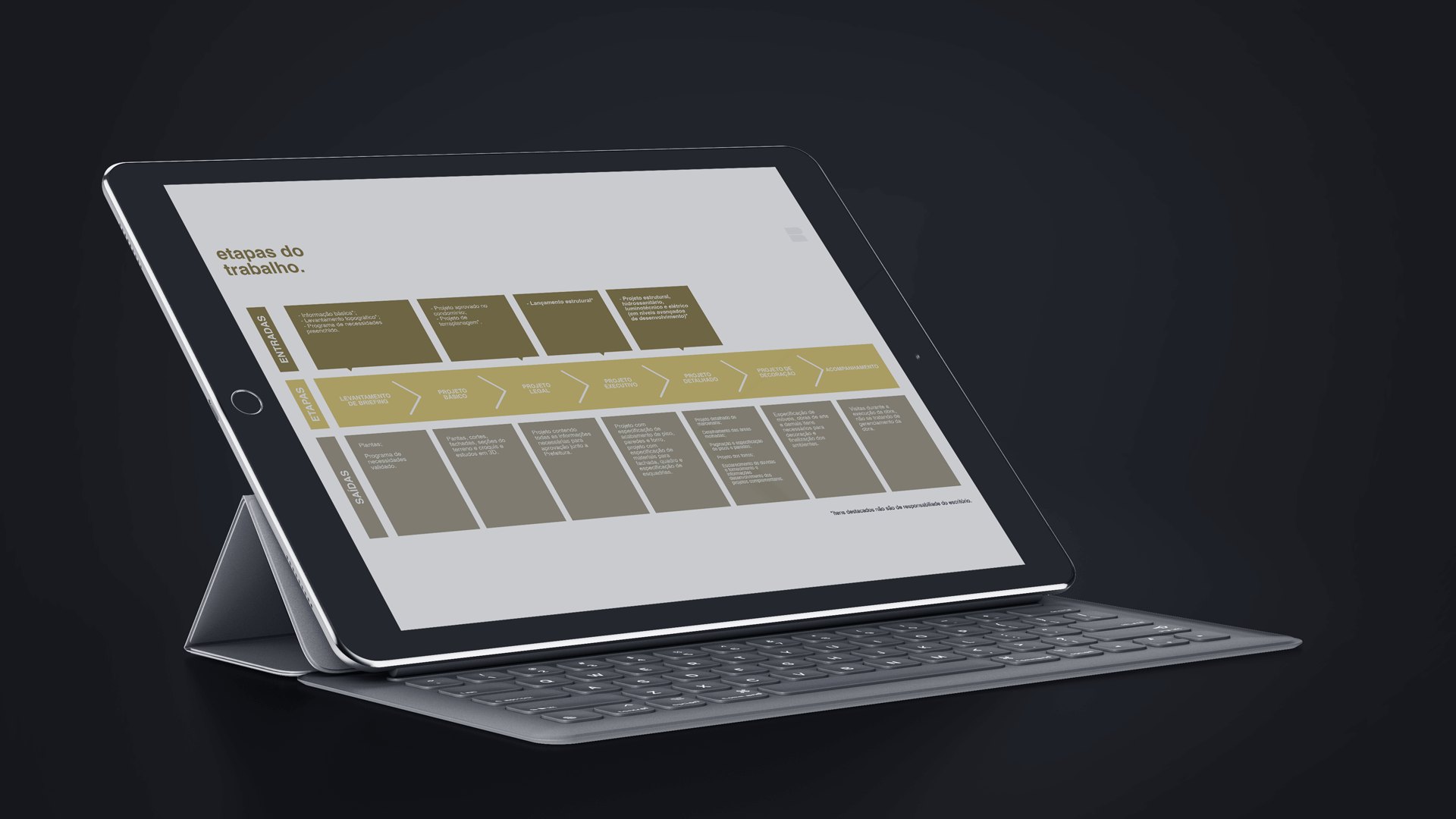
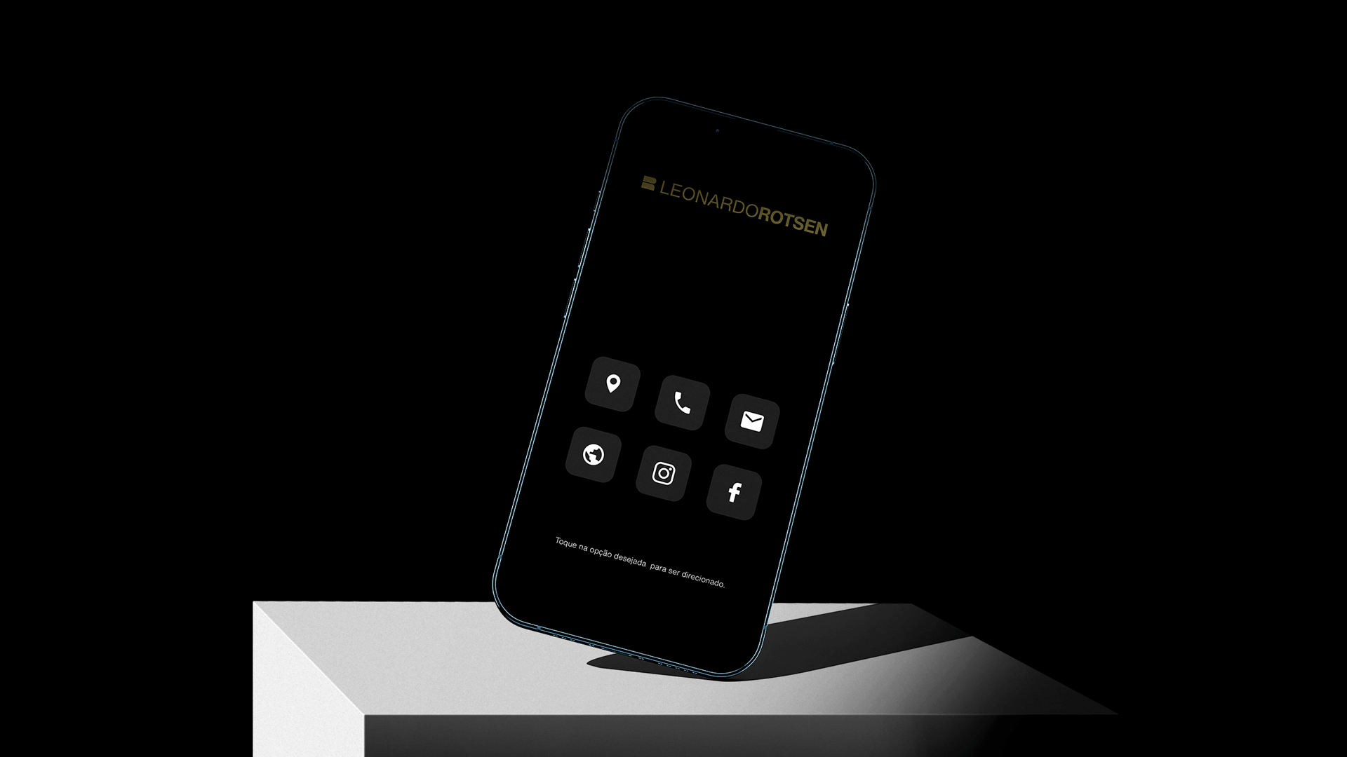
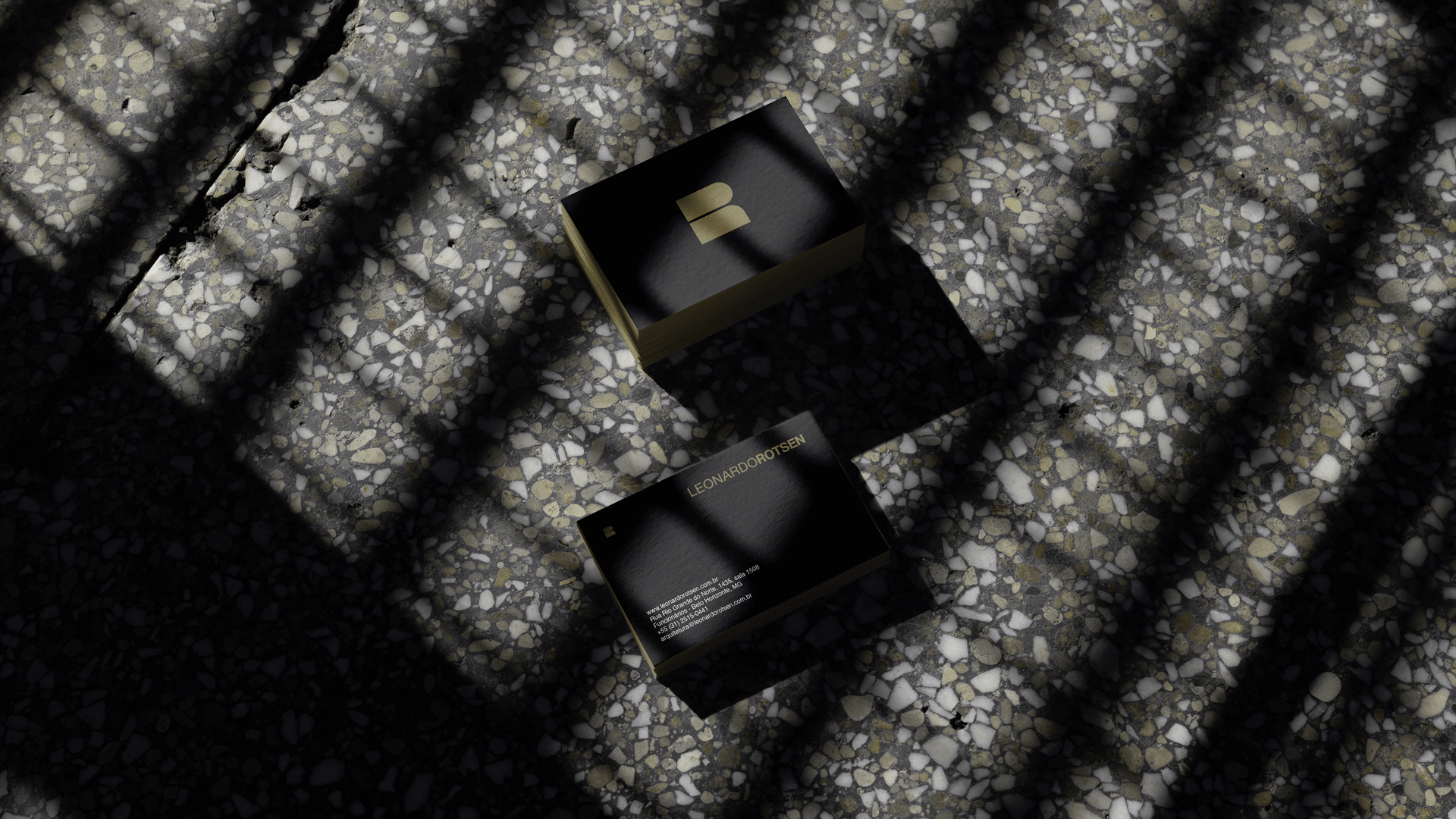
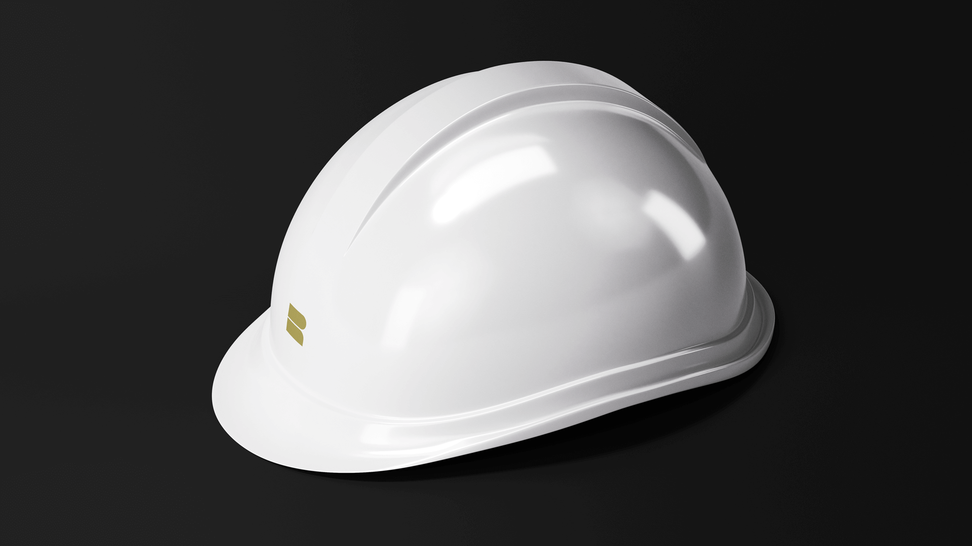
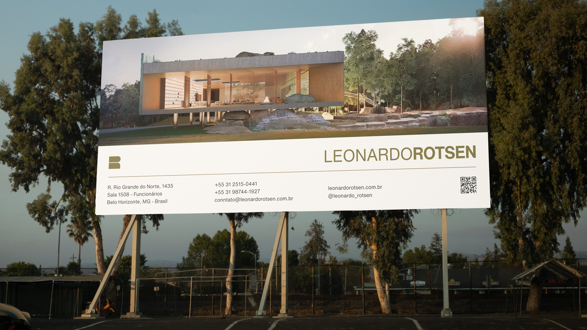
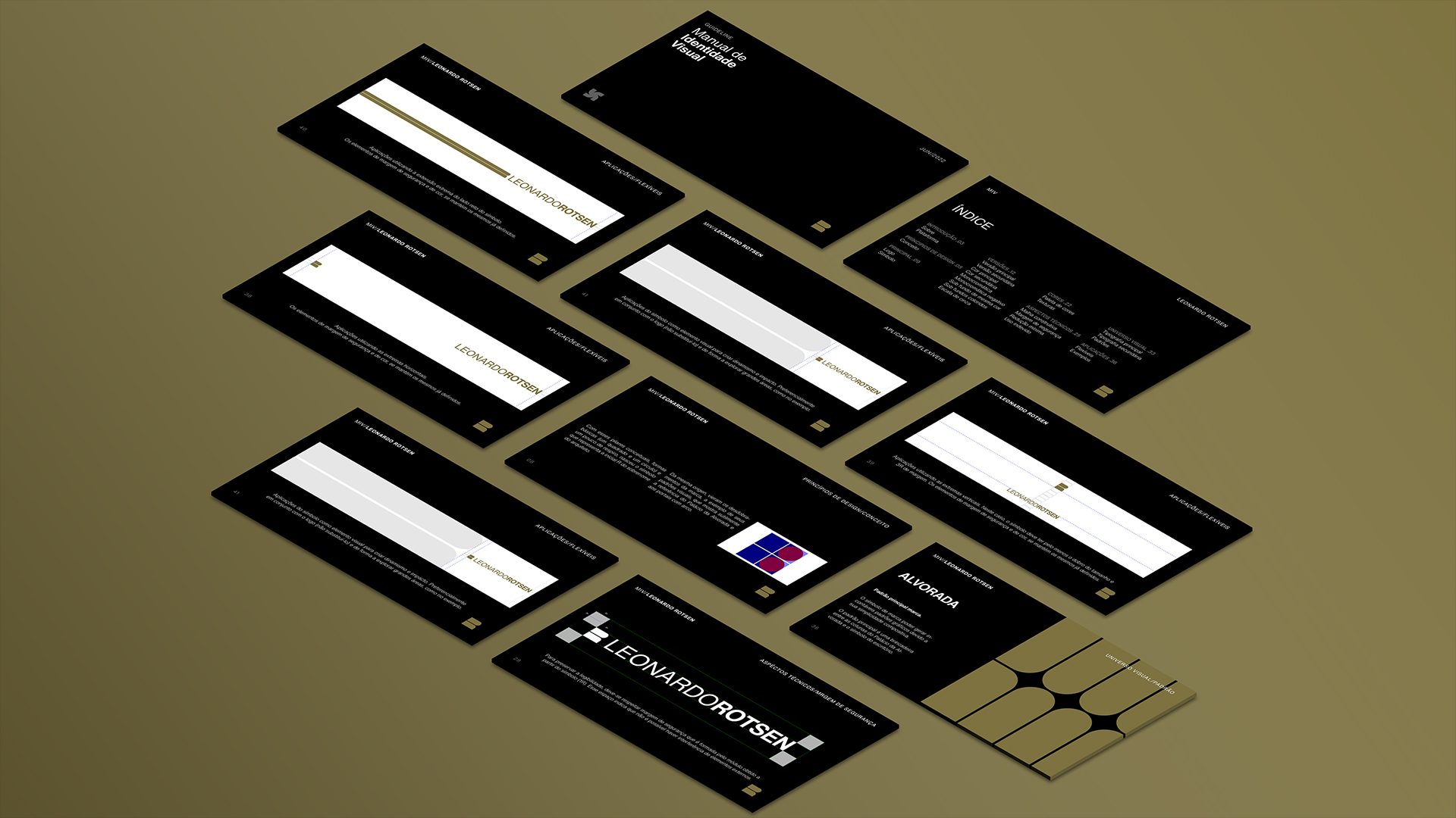
Applications & Tools
In addition to the institutional aspect, we study the main points of contact that the firm has with stakeholders. To keep the brand consistent, we developed the materials for daily use with the new identity and adapted the tools already used in the office (Power Point, AutoCad, etc.)